Introduction
Photoshop color correction vs color grading is an important topic for photographers, graphic designers, digital artists, and content creators. Both techniques are used to improve the appearance of images, but they serve different purposes.
Color correction focuses on fixing problems in an image. It can help correct inaccurate white balance, exposure, brightness, contrast, and unwanted color casts. The goal is usually to make an image look natural, balanced, and technically accurate.
Color grading, on the other hand, is primarily a creative process. It changes the colors and overall mood of an image to create a particular visual style. A photographer might use warm tones for a nostalgic appearance or cooler tones for a dramatic atmosphere.
Adobe Photoshop provides many tools for performing both color correction and color grading. Adjustment Layers, Curves, Levels, Color Balance, Hue/Saturation, Camera Raw Filter, Gradient Map, and Selective Color can all play important roles in professional image editing.
Understanding the difference between these techniques can help beginners build better editing workflows and help experienced users achieve more consistent results.
What Is Photoshop Color Correction?
Photoshop color correction is the process of fixing technical or visual color problems in an image.
A photograph may look too dark, too bright, too warm, too cool, or have an unwanted color cast. Color correction helps bring the image closer to a balanced and realistic appearance.
Common color correction tasks include:
- Fixing white balance
- Correcting exposure
- Adjusting brightness
- Improving contrast
- Removing unwanted color casts
- Balancing highlights and shadows
- Correcting skin tones
- Improving overall color accuracy
The purpose is not necessarily to create a dramatic style. Instead, the editor attempts to establish a clean and balanced starting point.
What Is Photoshop Color Grading?
Photoshop color grading is the creative process of changing an image’s colors to produce a specific mood, atmosphere, or visual style.
Unlike correction, grading does not necessarily try to make colors technically accurate.
For example, a designer might intentionally add:
- Warm orange highlights
- Cool blue shadows
- Muted colors
- Cinematic contrast
- Vintage tones
- High-contrast color combinations
- Soft pastel colors
Color grading is often used after basic color correction.
The corrected image provides a balanced foundation, while grading adds the creative appearance.
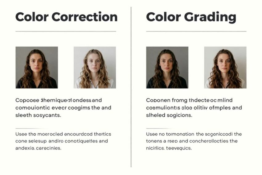
Photoshop Color Correction vs Color Grading
The main difference is the purpose of the edit.
Color correction = fixing and balancing an image
Color grading = creatively styling an image
Color correction generally answers the question:
How can I make this image look accurate and balanced?
Color grading asks:
How can I make this image feel a particular way?
Both techniques can be used together in the same Photoshop project.
Why Color Correction Comes First
In many professional workflows, color correction comes before creative grading.
Imagine a portrait photograph that has a strong yellow color cast. If you immediately apply a creative blue-orange cinematic effect, the existing color problem may become harder to control.
Correcting the white balance first creates a more neutral foundation.
A typical workflow can be:
- Correct exposure.
- Fix white balance.
- Adjust contrast.
- Balance highlights and shadows.
- Correct important skin tones.
- Apply creative color grading.
- Fine-tune saturation and contrast.
- Review the final image.
This approach makes the editing process easier to control.
Essential Photoshop Color Correction Tools
Photoshop provides many tools for correcting colors.
1. Camera Raw Filter
The Camera Raw Filter is one of the most useful options for overall image adjustments.
It can provide controls for:
- Temperature
- Tint
- Exposure
- Contrast
- Highlights
- Shadows
- Whites
- Blacks
- Texture
- Clarity
- Vibrance
- Saturation
It is especially useful for making broad adjustments before detailed Photoshop editing.
2. Curves
The Curves adjustment provides precise control over brightness and color channels.
You can use the RGB curve to adjust tonal contrast or select individual channels to modify color relationships.
For example:
- Red channel adjustments can influence red and cyan.
- Green channel adjustments can influence green and magenta.
- Blue channel adjustments can influence blue and yellow.
Curves are powerful because they allow localized tonal and color changes.
3. Levels
Levels is another important color correction tool.
It provides controls for:
- Shadows
- Midtones
- Highlights
Levels can help improve an image that looks flat or lacks tonal range.
It is often useful for quick corrections when you need to establish stronger black and white points.
4. Color Balance
Color Balance allows you to adjust colors in shadows, midtones, and highlights.
For example, you can introduce:
- Cyan or red
- Magenta or green
- Yellow or blue
This makes Color Balance useful for correcting subtle color casts.
It can also be used creatively for grading.
5. Hue/Saturation
The Hue/Saturation adjustment gives you control over individual color ranges.
You can modify:
- Hue
- Saturation
- Lightness
Instead of changing every color equally, you can target specific colors.
For example, you might reduce excessive green saturation in grass or adjust the hue of blue skies.
6. Selective Color
Selective Color is useful when you need detailed control over individual color groups.
You can adjust colors such as:
- Reds
- Yellows
- Greens
- Cyans
- Blues
- Magentas
- Whites
- Neutrals
- Blacks
This can be particularly helpful when fine-tuning photographs after broader corrections.
7. Adjustment Layers
Adjustment Layers are an important part of a non-destructive Photoshop workflow.
Instead of permanently changing the original pixels, Adjustment Layers allow you to modify the image while keeping the original layer information intact.
Useful Adjustment Layers include:
- Curves
- Levels
- Color Balance
- Hue/Saturation
- Selective Color
- Vibrance
- Black & White
- Gradient Map
Adjustment Layers also allow you to return later and modify the settings.
Photoshop Color Grading Techniques
Once an image has been corrected, you can begin experimenting with creative grading.
Warm and Cool Color Grading
One popular technique is creating contrast between warm and cool colors.
For example, you could create:
- Warm highlights
- Cooler shadows
This can add depth and visual separation.
However, subtle adjustments often produce more professional results than extreme color changes.
Cinematic Color Grading
Cinematic color grading attempts to create a film-inspired appearance.
Common characteristics include:
- Controlled saturation
- Strong tonal contrast
- Warm skin tones
- Cooler shadows
- Muted background colors
Photoshop tools such as Curves, Color Balance, Selective Color, and Gradient Map can be combined to create this effect.
The exact appearance depends on the image and the desired visual style.
Vintage Color Grading
Vintage grading can give modern photographs an older photographic appearance.
Techniques may include:
- Lowering contrast
- Reducing saturation
- Adding warm tones
- Introducing subtle color shifts
- Creating faded highlights
A Gradient Map or Curves adjustment can help create this type of look.
The effect should generally be controlled carefully to avoid making the image appear unnatural.
Black and White Grading
Color grading is not limited to colorful images.
A photograph can be converted into black and white and then adjusted for a specific mood.
You can control:
- Brightness
- Contrast
- Shadow depth
- Highlight detail
- Individual color luminosity before conversion
Black-and-white editing can be especially effective for portraits, architecture, and documentary-style photography.
Skin Tone Color Correction
Skin tones require careful attention because humans are highly sensitive to unnatural facial colors.
Common problems include:
- Excessive red
- Too much yellow
- Green color casts
- Oversaturation
- Uneven skin color
A useful workflow is to correct the overall white balance first and then make localized adjustments where necessary.
Tools such as Curves, Hue/Saturation, Selective Color, and Camera Raw Filter can help.
It is important to avoid removing all natural variation from skin because this can make portraits appear artificial.
Color Correction for Landscape Photos
Landscape photography often requires adjustments to skies, vegetation, rocks, and water.
Common corrections include:
- Recovering highlight detail
- Improving shadow detail
- Correcting white balance
- Controlling excessive saturation
- Balancing sky and foreground colors
Color grading can then be used to create a particular atmosphere.
For example, a landscape can be given warmer golden-hour tones or cooler tones for a dramatic environment.
Color Correction for Product Photography
Product photographs usually require accurate and consistent colors.
This is particularly important for e-commerce because customers expect products to appear similar to their real-world appearance.
A typical workflow can include:
- Correct white balance.
- Adjust exposure.
- Improve contrast.
- Match product colors.
- Remove unwanted color casts.
- Check background neutrality.
- Compare the final image against the actual product.
Creative grading should be used carefully for commercial product images because excessive color changes can misrepresent the product.
Using Masks for Precise Color Editing
Layer masks allow you to apply corrections to specific areas of an image.
For example, you could correct:
- The sky
- A person’s face
- Clothing
- Background
- Product
- Foreground
without changing the entire photograph.
This is especially useful when one part of the image has a different color problem from another.
Masks can also be combined with Adjustment Layers for a flexible, non-destructive workflow.
Color Correction and Color Grading Workflow
A professional Photoshop workflow can be divided into several stages.
Step 1: Evaluate the Original Image
Before editing, inspect:
- Exposure
- White balance
- Contrast
- Shadows
- Highlights
- Saturation
- Skin tones
Understanding the problem prevents unnecessary adjustments.
Step 2: Correct Technical Problems
Start with exposure and white balance.
Do not immediately apply strong creative effects.
Step 3: Improve Tonal Balance
Use Levels or Curves to establish a suitable tonal range.
Step 4: Correct Specific Colors
Use Hue/Saturation, Color Balance, or Selective Color for problem areas.
Step 5: Add Creative Grading
Once the image is balanced, introduce your preferred visual style.
Step 6: Fine-Tune
Reduce excessive saturation or contrast if necessary.
Step 7: Compare Before and After
Temporarily disable Adjustment Layers to compare the edited image with the original.
This helps prevent over-editing.
Common Color Correction Mistakes
Beginners often make several mistakes during Photoshop color correction.
Over-Saturation
Increasing saturation too much can make photographs look unrealistic.
Excessive Contrast
Too much contrast can remove detail from shadows and highlights.
Incorrect White Balance
A photograph that is too warm or too cool can look unnatural.
Overusing Color Grading
Creative effects should support the image rather than overpower it.
Editing Without Masks
Global adjustments can sometimes damage colors in areas that were already correct.
Ignoring Skin Tones
Portrait editing requires special attention because unnatural skin colors are easy to notice.
How AI Can Help Photoshop Color Correction
AI-powered features are becoming increasingly important in image editing.
Modern Photoshop workflows can use intelligent tools to help with tasks such as:
- Object selection
- Background selection
- Image enhancement
- Mask creation
- Generative editing
- Automated adjustments
AI can reduce the time required for repetitive editing tasks, but human judgment remains important.
Color correction still requires visual evaluation because every photograph has different lighting, subject matter, and creative requirements.
Best Practices for Professional Color Editing
For better Photoshop color correction and grading, follow these practices:
- Work non-destructively.
- Use Adjustment Layers.
- Save original images separately.
- Use layer masks.
- Make small adjustments.
- Avoid excessive saturation.
- Check skin tones carefully.
- Compare before and after.
- Use consistent editing settings for batches.
- Review images on a calibrated display when accurate color matters.
These practices can improve both consistency and flexibility.
Why Color Correction and Grading Work Together
Color correction and color grading are not competing techniques.
They solve different problems.
Correction establishes a balanced foundation, while grading creates the final visual identity.
For example, a wedding photographer might first correct exposure and white balance before adding warm tones to create a romantic appearance.
A commercial photographer may correct product colors but apply only minimal grading to preserve accuracy.
A digital artist may perform basic corrections and then use strong grading to create a completely fictional atmosphere.
The appropriate workflow depends on the purpose of the image.
Future of Photoshop Color Correction
The future of Photoshop color correction is likely to involve greater automation and AI assistance.
Potential developments include:
- Faster automatic color balancing
- More intelligent masking
- AI-powered image analysis
- Improved object-specific adjustments
- Automated batch correction
- Smarter skin-tone detection
- More advanced generative editing
These technologies could make complex editing tasks easier for beginners while giving professionals more time for creative decisions.
However, automation is unlikely to eliminate the need for human judgment. Color is closely connected to mood, branding, storytelling, and artistic intent.
Conclusion
Photoshop color correction vs color grading represents two different but closely connected stages of image editing.
Color correction focuses on fixing technical problems such as exposure, white balance, contrast, and unwanted color casts. Color grading focuses on creating a visual mood, atmosphere, or artistic style.
Photoshop provides a wide range of tools for both processes, including Camera Raw Filter, Curves, Levels, Color Balance, Hue/Saturation, Selective Color, Gradient Map, and Adjustment Layers.
A strong editing workflow generally begins with correction and then moves toward creative grading. Using masks and non-destructive Adjustment Layers can provide greater control while protecting the original image.
Whether you are editing portraits, landscapes, product photographs, social media graphics, or creative artwork, understanding the difference between correction and grading can help you achieve more consistent results.
Color correction makes an image balanced, while color grading gives it a visual personality. Learning how to combine both techniques is one of the most useful skills for professional Photoshop editing.